Disney World Website Update Improves Navigation and User Experience

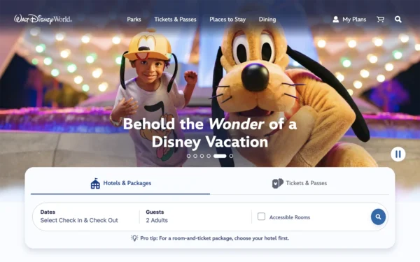
Disney IT must have been holding its collective breath this morning as it rolled out an update to the Walt Disney World website. But it looks like everyone can exhale.
The updated site is a significant improvement over what it replaced, even with large portions of DisneyWorld.com remaining unchanged. The new design feels familiar, but with softer touches. Space has been added. Links have been removed. Overall, the site is cleaner, easier to navigate, and more modern than it was yesterday.
Improved header
This is where IT made some hay.
On the homepage, the new site header floats over a large “hero” image below. Once users start scrolling, the header receives a white background as its text flips from light to dark.
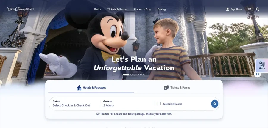
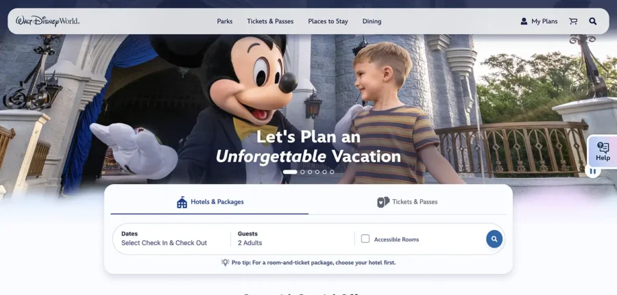
The vacation planner is no longer pinned to the top of the page. Instead, it floats over the lead image further down the screen. Unpairing it from the header improves the flow immensely.
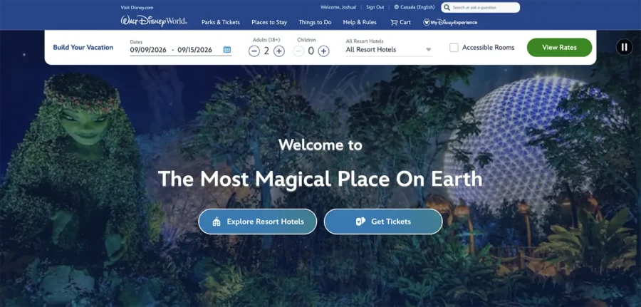
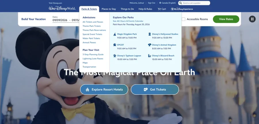
The header has been significantly decluttered. The interface now has more breathing room, while the menu lists have been trimmed down. Together, those changes make it easier to drill down to the information you need without accidentally clicking the wrong link.
It’s now organized to guide people through the site more naturally. Content has also been reorganized. Parks now have their own tab instead of sharing space with Tickets. “Things To Do” is now simply “Dining.”
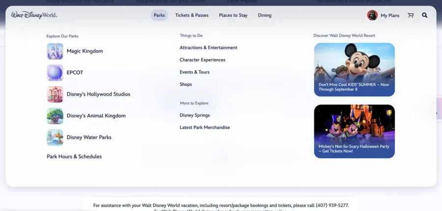
Illustrated icons add some visual interest while helping guide visitors. Calls to action on the right side of the panel allow Disney to promote Mickey’s Not-So-Scary Halloween Party, dining packages, and more without getting in the way of regular navigation.
“Help & Rules” is gone, as are other elements that could distract people from exploring and, more importantly, booking a Walt Disney World vacation.
Yep, this isn’t just a redesign. It’s about improving the user experience (UX) while gently steering guests toward the actions Disney most wants them to take. They don’t want guests wandering off to an ESPN Wide World of Sports page when they’re this close to booking a week at Art of Animation.
One interesting note about Disney’s header: It’s only sticky – meaning it remains in place while scrolling – on the homepage. It scrolls off the screen on every other page.
Search
This update is more about accessing search than the search results. Disney is looking to add AI to the search features on its website and in the My Disney Experience and Disneyland apps, but that hasn’t happened yet.
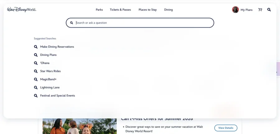
What this update does address is another UX issue with the old site: the search field was too small. Previously, Disney displayed the field in the header. Now, users tap or click the search icon to reveal a much larger input. My eyes appreciate the larger font and extra padding.
My Disney Experience becomes My Plans
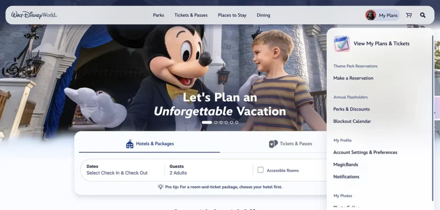
Disney has opted for a simple label instead of a branded one for arguably the most important tab on the site: the one containing information about your vacations.
Like the other tabs, this section’s dropdown menu has been pared down, from 12 links to eight. I would’ve liked the designers to make this a wide panel like the other menu items, but that’s a small nit.
Mobile views
This update also dramatically improves the mobile user experience.
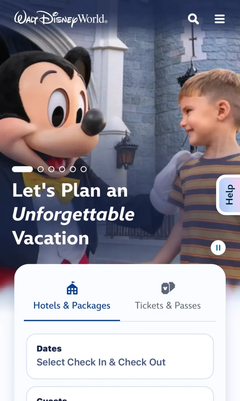
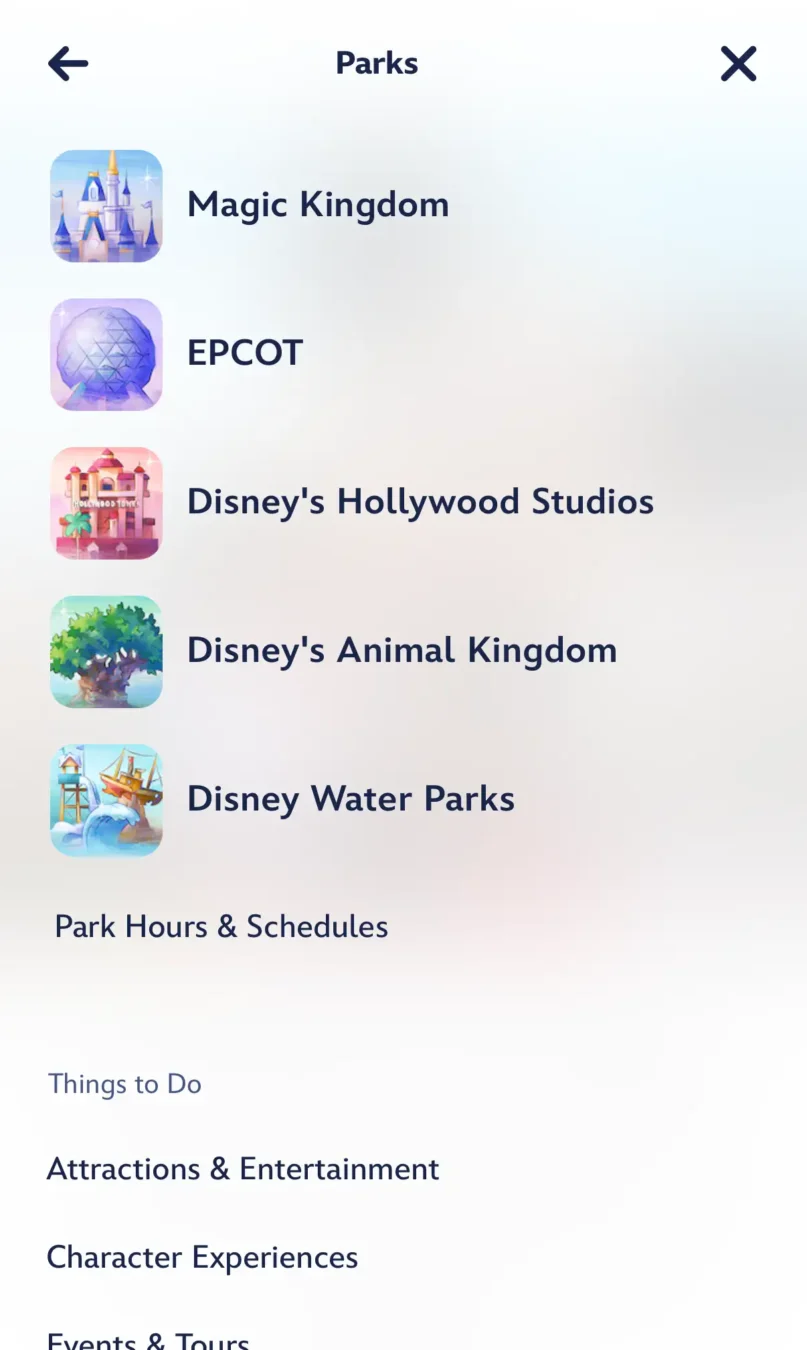
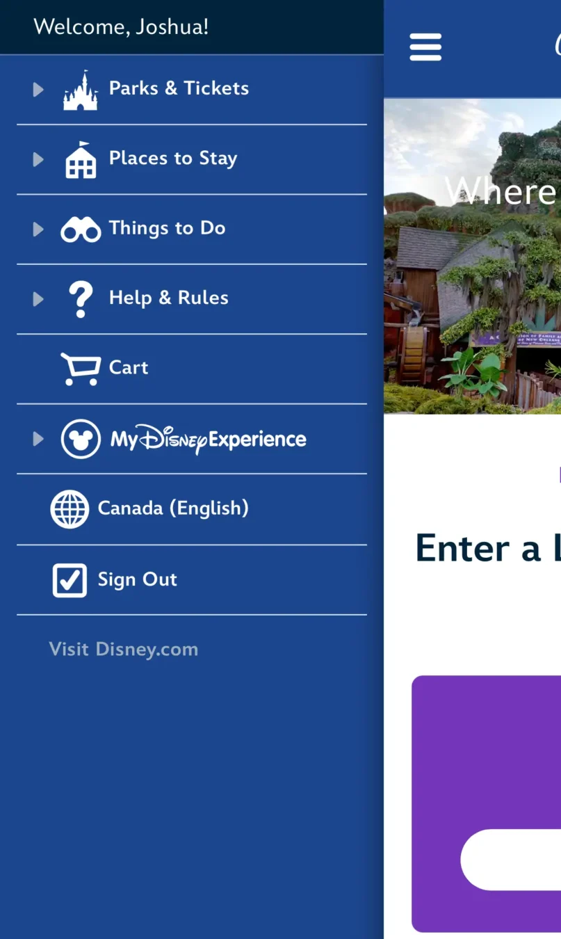
The mobile menu now takes over the entire screen when opened, giving every item considerably more room. That means fewer cramped links and fewer opportunities for your thumb to choose a vacation option you had absolutely no intention of choosing.
Minor issues
As a developer, I like to look under the hood whenever a new website rolls out. One of the areas I pay particular attention to is ADA compliance. In a nutshell, I check to see if a website is built so people with disabilities can navigate and use it with assistive technologies such as screen readers and keyboards.
Overall, Disney continues to do excellent work in this area. There are a few issues with the latest rollout, but all of them appear easy to fix. I won’t get too far into the weeds, but IT needs to add labels to interactive elements throughout the site.
The site also has some contrast errors, mostly where text overlays images. Those areas may be perfectly readable to the human eye, but automated accessibility tools can’t always determine whether enough contrast exists. That’s another relatively simple fix with some additional styling.
The good news is that none of the issues I found should have much effect on the experience for most users, and they’re the sort of things that can be cleaned up without changing the design.
A sign of things to come
This rollout is a continuation of IT’s consolidation of Disney’s websites and My Disney Experience and Disneyland apps. A cohesive design across those platforms is good for everyone. Guests learn where things are and how they work, while Disney’s IT teams can rely on a shared library of components to add and update features more efficiently.
The redesigned Walt Disney World website is now live.
Read more: Disney Is Retiring the Play Disney Parks App